Layouts
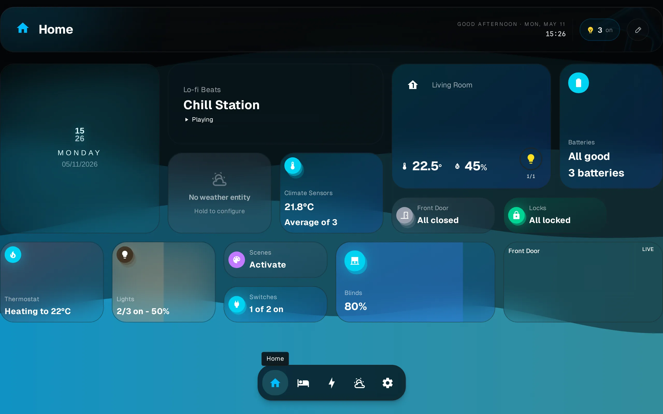
Each dashboard keeps its own independent layout per breakpoint. Rearranging on your phone does not change the desktop layout.
Layouts are per breakpoint
Dash stores a separate widget arrangement for each screen-width breakpoint. Changes you make on a phone (small breakpoint) leave the tablet and desktop layouts untouched.
Responsive Breakpoints
The grid adapts columns to screen width.
| Breakpoint | Width | Columns |
|---|---|---|
lg | ≥1024px | 12 |
md | ≥768px | 8 |
sm | <768px | 4 |
Editing
All editing (moving, resizing, adding, removing widgets) happens in edit mode. See Editing for the full gesture reference and step-by-step.
Multiple Dashboards
Create dashboards in Settings > Dashboards. Each has its own widget set and independent layout per breakpoint. Switch between dashboards via the dock at the bottom of the screen.
Manage dashboards (rename, delete, reorder) in Settings > Dashboards.