
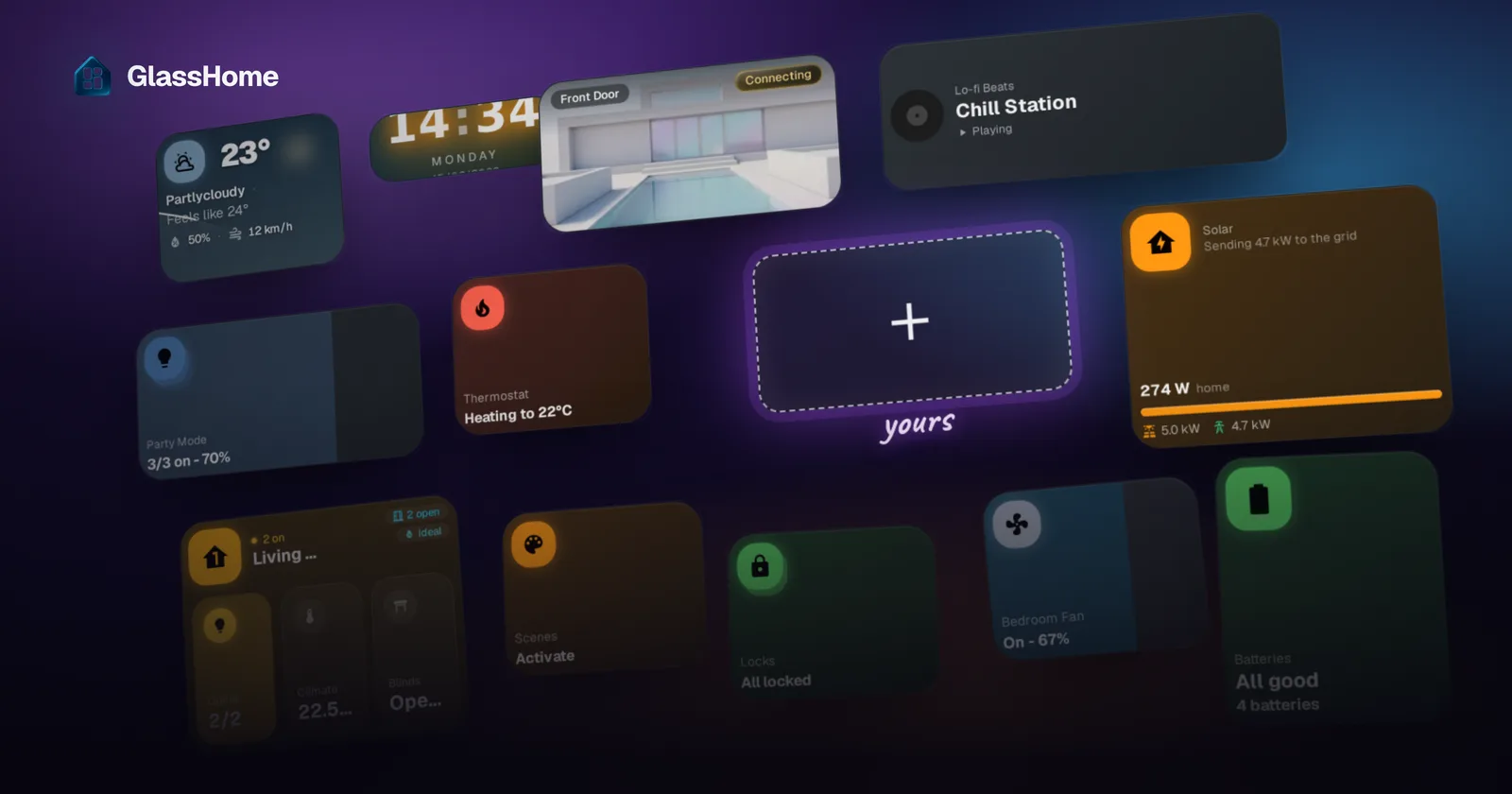
This is what we’re building:
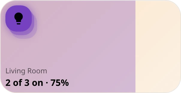
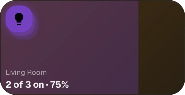
Three lights, one tile. The violet comes from the bulbs.
This runs in GlassHome, not in Home Assistant
GlassHome is a separate dashboard app that talks to Home Assistant, so what you build here is a GlassHome widget, not a Lovelace card.
Three names, used precisely from here on (glossary):
- Dash is the app on your hardware. It holds the Home Assistant connection and runs your widget.
- A dashboard is one screen inside Dash, the grid your tiles sit on.
- Hub is glasshome.app, where widgets are published. Optional until the last step.
What you need
- Bun. Install it with mise, or from bun.sh.
- A Dash instance you can reach over HTTP. Port
3123by default, sohttp://192.168.1.50:3123. With the HA add-on that’s your HA machine’s IP, not the ingress URL in the sidebar. - A browser on the machine you’re typing on, for the approval step. On a headless box, run the CLI from your laptop instead.
- A free GlassHome account, for the publish step only.
The anatomy of a widget
A widget is a folder with two files in it:
my-widgets/
└── src/
    └── my-lights/
        ├── index.tsx        # you write this
        └── manifest.json    # mostly written for you
index.tsx has one default export: a call to defineWidget taking three things, each becoming a different surface:
The build writes manifest.json from that manifest block, so edit the code, not the JSON. Two fields are the file’s own: version (publish bumps it) and sdkVersion (bun widget upgrade moves it).
Where your code runs
Your widget builds to one JavaScript file. Dash mounts it in a closed shadow root inside a tile:
- CSS can’t leak either way. Dash passes its theme tokens through the boundary, which is why step 1’s tile already looks like GlassHome.
- Each tile is its own instance, with its own state.
- No credentials. Your widget never sees a Home Assistant token. It asks the SDK for entities; service calls cross a bridge that checks them against the approved capabilities.
A SolidJS crash course, if you know React
SolidJS looks like React until it doesn’t. Four rules cover this tutorial:
- A reactive value is a function you call. Solid calls these accessors:
createSignalis roughlyuseState, read ascount(). - The component body runs once, at mount. Anything that re-runs lives in a
createMemo, acreateEffect, or the JSX. - Pass the function, not the value, to hand reactivity across a boundary. Hence
useEntities(() => props.config.entityIds), andaggregationMode: () => "light"even for a constant. - Use
<Show>, not&&. Since the body runs once,{cond && <div/>}evaluates eagerly.
No dependency arrays: memos and effects track the accessors they touch. The SolidJS tutorial has the rest.
Step 1: a tile on the screen
Scaffold a project:
bunx @glasshome/widget-cli@latest
cd my-widgets
It asks for a project name, then a widget name. Names are lowercase with hyphens, so type my-lights; My Lights is rejected.
◇  Widget name
│  my-lights
│
◇  Created my-widgets/ with widget "my-lights"
The project ships a .mise.toml, so mise install pins the toolchain.
Icons come from Iconify, which the scaffold doesn’t include, so add it:
bun add @iconify-icon/solidOpen src/my-lights/index.tsx. The scaffold left a click-counter there; replace all of it. Every later step adds to this same file:
// src/my-lights/index.tsx
import { defineConfig, defineWidget, field, type Infer, Widget } from "@glasshome/widget-sdk";
import { Icon } from "@iconify-icon/solid";

// 1. the config schema
const configSchema = defineConfig({
  title: field.title(),
});

type Config = Infer<typeof configSchema>;

// 2. the component (a named function, so we have somewhere to put things later)
function MyLightsWidget(props: { config: Config }) {
  return (
    <Widget variant="classic-glass">
      <Widget.Content>
        <Widget.Icon icon={<Icon icon="mdi:lightbulb-outline" />} />
        <div class="flex flex-col gap-1 overflow-hidden">
          <Widget.Title>{props.config.title || "Lights"}</Widget.Title>
          <Widget.Status>Nothing wired up yet</Widget.Status>
        </div>
      </Widget.Content>
    </Widget>
  );
}

// 3. the manifest, and the three pieces tied together
export default defineWidget<Config>({
  manifest: {
    name: "My Lights",
    icon: "mdi:lightbulb-group",
    minSize: { w: 1, h: 1 },
    maxSize: { w: 4, h: 4 },
    sdkVersion: "^1.11.2", // the scaffold fills this in for you
  },
  configSchema,
  component: MyLightsWidget,
});
Check it compiles:
bun widget build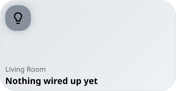
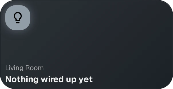
Nothing there describes glass, blur, radius or dark mode. <Widget> is the shell, <Widget.Content> the padded region, and the slots (Icon, Title, Status, Value) place content at the type scale every other tile uses.
Sizes are grid cells, roughly 90 by 70 pixels on desktop. minSize and maxSize bound what a user can resize to; the tile above is 3 by 2.
Step 2: let the user choose the lights
A widget hardcoded to your bulbs is a snippet. Configuration makes it installable, and you write none of that UI: declare fields, Dash builds the form.
Change the schema at the top of the file to add a second field:
const configSchema = defineConfig({
  title: field.title(),
  entityIds: field.entities("light"),
});

type Config = Infer<typeof configSchema>;
// Config is now: { title?: string; entityIds: string[] }field.entities("light") is a picker restricted to the light domain. Infer turns the schema into your config type, so props.config stays typed without an interface.
They’re Zod schemas underneath, but the builders cover the usual shapes (text, number, toggle, choice, entity, area, icon, group, list). One rule: a field with a default is required, without one it’s optional. Full list in the config reference.
Nothing reads that field yet. Next step does.
Step 3: teach it to read the room
One light is easy. Five lights as one tile means answering questions with annoying edge cases:
- The group is “on” if any light is on. Or should it be all of them?
- What’s the brightness of a group where two lights are at 80% and one is off? (Not 53%.)
- What colour represents a group where one bulb reports
rgb_colorand another reportshs_color? - One bulb is unavailable. Is the tile unavailable?
Get those wrong and your widget works in your house and not in someone else’s. useWidgetEntityGroup answers all four. Add this inside MyLightsWidget, above the return:
const entities = useEntities(() => props.config.entityIds);

const { aggregatedData, emptyState, hasEntities } = useWidgetEntityGroup({
  entities,
  aggregationMode: () => "light",
  emptyStateConfig: {
    icon: <span>💡</span>,
    title: "No lights yet",
    message: "Hold to pick some",
  },
});

const lights = createMemo(() => {
  const data = aggregatedData();
  return data && "onCount" in data ? data : undefined;
});
and extend the import at the top of the file:
import {
  defineConfig,
  defineWidget,
  field,
  type Infer,
  useEntities,
  useWidgetEntityGroup,
  Widget,
} from "@glasshome/widget-sdk";
import { createMemo, Show } from "solid-js";
useEntities resolves the configured ids into live entities. useWidgetEntityGroup rolls them up, so lights() gives you isOn, onCount, totalCount, brightnessPercent and a blended color, recomputed as state arrives.
The answers are the careful ones: brightness averages only the lights that are on, both colour formats resolve to one swatch, and one unavailable bulb doesn’t make the tile unavailable. Want “on” to mean all of them? Pass allEntitiesMode: true.
aggregationMode picks the questions: "light" for the above, "switch" and "binary-sensor" without brightness or colour, "sensor" for numbers with a choice of maths. So “average these five temperature sensors” and “sum these three power meters” are one widget with a different setting. Result shapes are in the SDK guide.
Why the createMemo
aggregatedData() is either a light-shaped or a sensor-shaped result, and only the light one has onCount, so "onCount" in data is what tells TypeScript which it holds.
Now use it. Replace the contents of <Widget>:
<Widget
  variant="classic-glass"
  tone={lights()?.isOn ? "accent" : "neutral"}
  emptyState={emptyState()}
  loading={!hasEntities()}
>
  <Show when={hasEntities()}>
    <Widget.Content>
      <Widget.Icon
        icon={<Icon icon={lights()?.isOn ? "mdi:lightbulb" : "mdi:lightbulb-outline"} />}
        entityCount={entities().length}
      />
      <div class="flex flex-col gap-1 overflow-hidden">
        <Widget.Title>{props.config.title || "Lights"}</Widget.Title>
        <Widget.Status>
          {lights()?.onCount ?? 0} of {lights()?.totalCount ?? 0} on
        </Widget.Status>
      </div>
    </Widget.Content>
  </Show>
</Widget>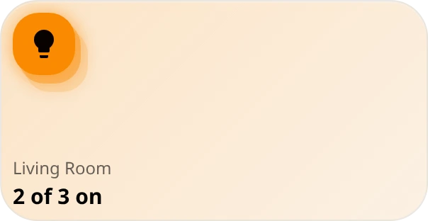
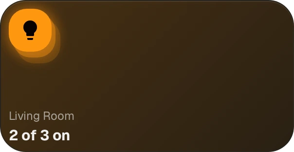
Two props did the work. entityCount stacks the icon’s discs so a group reads as a group. tone="accent" shifts the tile’s colour channel when the lights are on.
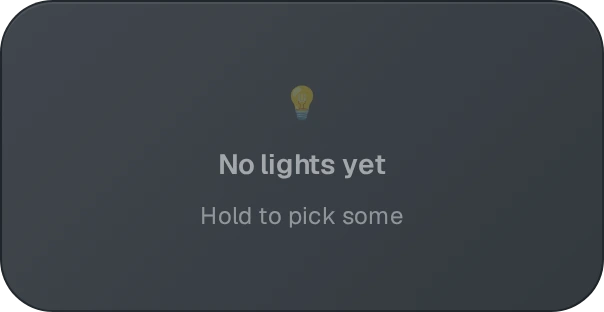
emptyState is the other half of that hook. Passed to <Widget>, an unconfigured tile renders this instead of a blank rectangle:
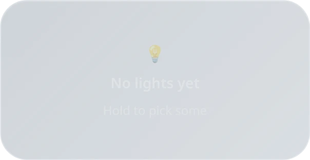
Step 4: make it do something
Three gestures, one hook. Add this inside the component, after the lights memo:
const { toggle, turnOn } = useService();
const { openDialog, setShowDialog, dialogProps } = useWidgetDialog();
const ctx = useWidgetContext();

const [dimmer, setDimmer] = createSignal(0);
const [dragging, setDragging] = createSignal(false);

// server state wins, except while a finger is on the tile
createEffect(() => {
  const fromServer = lights()?.brightnessPercent ?? 0;
  if (!dragging()) setDimmer(fromServer);
});

let commit: ReturnType<typeof setTimeout> | undefined;

const gestures = useWidgetGestures(() => ({
  tap: () => toggle(entities().map((e) => e.id)),
  hold: { action: openDialog },
  slide: {
    value: dimmer(),
    min: 0,
    max: 100,
    onChange: (value) => {
      setDragging(true);
      setDimmer(value); // the tile follows the finger now
      clearTimeout(commit);
      commit = setTimeout(() => { // the lights follow once it settles
        setDragging(false);
        turnOn(entities().map((e) => e.id), { brightness_pct: value });
      }, 300);
    },
  },
}));
onCleanup(gestures.dispose);
Then hand the gestures to the tile. I have forgotten this line and debugged the wrong thing for half an hour: the hook only returns handlers, and <Widget> is what binds them to pointer events. No gestures prop, no reaction to anything. While we’re in there, add the fill that follows the drag:
<Widget
  gestures={gestures}
  variant="classic-glass"
  tone={lights()?.isOn ? "accent" : "neutral"}
  emptyState={emptyState()}
  loading={!hasEntities()}
>
  <Show when={hasEntities()}>
    <WidgetSliderFill value={dimmer()} color={lights()?.color} isDragging={dragging()} />
    {/* …the Widget.Content from step 3… */}
  </Show>
</Widget>onCleanup is Solid’s unmount hook, and dispose tears down the size observer the slide gesture uses.
slide carries the most machinery: it picks the drag axis from the tile’s shape, sets touch-action so the dashboard still scrolls on the other axis, separates tap from drag with a movement threshold, and fires a haptic bump when a hold commits.
You own the optimistic part, because a round trip is slower than a finger: dimmer leads, and the createEffect hands control back to server state when the drag ends. Without it the tile stutters back to the old brightness on every frame.
Ask for permission
Service calls are what your widget cannot do unaided. Declare what it needs in the manifest:
capabilities: [{ domain: "light", access: "control" }],read displays lights, control changes them, and the user sees which you asked for. Ask for the narrowest that works.
Your tile will ask before it appears
The first time you add a widget that declares capabilities, Dash shows a consent card in its place listing what it wants to touch, and the widget doesn’t mount until you approve. Approve it once and the tile takes over.
The whole widget
Here’s the complete file, which is also the one that rendered every screenshot above:
// src/my-lights/index.tsx
import {
  Button,
  defineConfig,
  defineWidget,
  field,
  type Infer,
  ResponsiveDialog,
  ResponsiveDialogContent,
  ResponsiveDialogDescription,
  ResponsiveDialogHeader,
  ResponsiveDialogTitle,
  SchemaForm,
  useEntities,
  useService,
  useWidgetContext,
  useWidgetDialog,
  useWidgetEntityGroup,
  useWidgetGestures,
  Widget,
  WidgetDialog,
  WidgetSliderFill,
} from "@glasshome/widget-sdk";
import { Icon } from "@iconify-icon/solid";
import { createEffect, createMemo, createSignal, onCleanup, Show } from "solid-js";

const configSchema = defineConfig({
  title: field.title(),
  entityIds: field.entities("light"),
});

type Config = Infer<typeof configSchema>;

function MyLightsWidget(props: { config: Config }) {
  const ctx = useWidgetContext();
  const { openDialog, setShowDialog, dialogProps } = useWidgetDialog();
  const { toggle, turnOn } = useService();

  const entities = useEntities(() => props.config.entityIds);

  const { aggregatedData, emptyState, hasEntities } = useWidgetEntityGroup({
    entities,
    aggregationMode: () => "light",
    emptyStateConfig: {
      icon: <span>💡</span>,
      title: "No lights yet",
      message: "Hold to pick some",
    },
  });

  const lights = createMemo(() => {
    const data = aggregatedData();
    return data && "onCount" in data ? data : undefined;
  });

  const [dimmer, setDimmer] = createSignal(0);
  const [dragging, setDragging] = createSignal(false);

  createEffect(() => {
    const fromServer = lights()?.brightnessPercent ?? 0;
    if (!dragging()) setDimmer(fromServer);
  });

  let commit: ReturnType<typeof setTimeout> | undefined;

  const gestures = useWidgetGestures(() => ({
    tap: () => toggle(entities().map((e) => e.id)),
    hold: { action: openDialog },
    slide: {
      value: dimmer(),
      min: 0,
      max: 100,
      onChange: (value) => {
        setDragging(true);
        setDimmer(value);
        clearTimeout(commit);
        commit = setTimeout(() => {
          setDragging(false);
          turnOn(entities().map((e) => e.id), { brightness_pct: value });
        }, 300);
      },
    },
  }));
  onCleanup(gestures.dispose);

  return (
    <>
      <Widget
        gestures={gestures}
        variant="classic-glass"
        tone={lights()?.isOn ? "accent" : "neutral"}
        emptyState={emptyState()}
        loading={!hasEntities()}
      >
        <Show when={hasEntities()}>
          <WidgetSliderFill value={dimmer()} color={lights()?.color} isDragging={dragging()} />
          <Widget.Content>
            <Widget.Icon
              icon={<Icon icon={lights()?.isOn ? "mdi:lightbulb" : "mdi:lightbulb-outline"} />}
              color={lights()?.isOn ? lights()?.color : undefined}
              entityCount={entities().length}
            />
            <div class="flex flex-col gap-1 overflow-hidden">
              <Widget.Title>{props.config.title || "Lights"}</Widget.Title>
              <Widget.Status>
                {lights()?.onCount ?? 0} of {lights()?.totalCount ?? 0} on
                {lights()?.isOn ? ` · ${dimmer()}%` : ""}
              </Widget.Status>
            </div>
          </Widget.Content>
        </Show>
      </Widget>

      <WidgetDialog
        {...dialogProps}
        ResponsiveDialog={ResponsiveDialog}
        ResponsiveDialogContent={ResponsiveDialogContent}
        ResponsiveDialogHeader={ResponsiveDialogHeader}
        ResponsiveDialogTitle={ResponsiveDialogTitle}
        ResponsiveDialogDescription={ResponsiveDialogDescription}
        Button={Button}
        SchemaForm={SchemaForm}
        title="Lights"
        configSchema={configSchema}
        config={props.config}
        onConfigSave={(config) => {
          ctx.updateConfig(config);
          setShowDialog(false);
        }}
      />
    </>
  );
}

export default defineWidget<Config>({
  manifest: {
    name: "My Lights",
    description: "Toggle and dim a group of lights",
    icon: "mdi:lightbulb-group",
    minSize: { w: 1, h: 1 },
    maxSize: { w: 4, h: 4 },
    defaultSize: { w: 2, h: 1 },
    sdkVersion: "^1.11.2",
    capabilities: [{ domain: "light", access: "control" }],
  },
  configSchema,
  component: MyLightsWidget,
});
Two pieces we haven’t discussed. WidgetDialog is the settings dialog hold opens: give it the configSchema from step 2 and it renders the form. It takes UI components as props so a widget can swap them, and copying that block verbatim is normal. useWidgetContext is your handle back to Dash, here just ctx.updateConfig, which saves the user’s changes and hands the new config back through props.config.
Import from the SDK, not from its dependencies
@glasshome/sync-layer and @glasshome/ui are provided by Dash at runtime, so importing them directly either bundles a second, disconnected copy or drifts when Dash updates underneath you. The SDK re-exports what you need from both. (Iconify is the exception we installed in step 1: the Solid wrapper is safe to bundle.)
Run it on your own dashboard
bun widget connect http://192.168.1.50:3123Use your own Dash address. This builds, opens a browser to approve the CLI against your Dash instance (not Hub), uploads the bundle and turns on dev mode. Then it sits there:
◇  Connected to http://192.168.1.50:3123
│
◇  Registered my-lights (local scope)
│
└  Watching src/ ... save to reload, Ctrl+C to unregister.
In Dash: tap the pencil, then Add Widget, pick “My Lights”, tap Done. Approve the capability card, then hold the tile to choose your lights.
Every save reloads the tile in place. Ctrl+C unregisters everything.
Publish it
bun widget publishThis validates, logs you into Hub if needed (a browser flow, so run it where you’re sitting), then asks which widget, scope and version bump. Your scope is your username, so it lands at @your-username/my-lights, installable in one click with your capabilities shown up front.
Versions are immutable, so shipping a change means --bump patch|minor|major. Change the shape of your config and you also need configVersion plus a migrate, which part 3 covers.
Where to go next
You’ve used about a third of the SDK. What we skipped:
- History and statistics hooks, and a spline helper for sparklines
- Weather forecasts, cameras, and calendars
- The user’s locale and unit preferences
- Area-scoped widgets, bound to a room
- Size-aware rendering: a number at 1x1, a chart at 4x2
- Dialog tabs, for a full control panel on hold
Where those are documented:
- Widget SDK guide for the full surface
- API reference for exact signatures
- Capabilities for what Dash will and won’t let you do
Pick the tile you keep wishing worked differently, and rebuild that. Post it in Discord when it ships.