Layouts
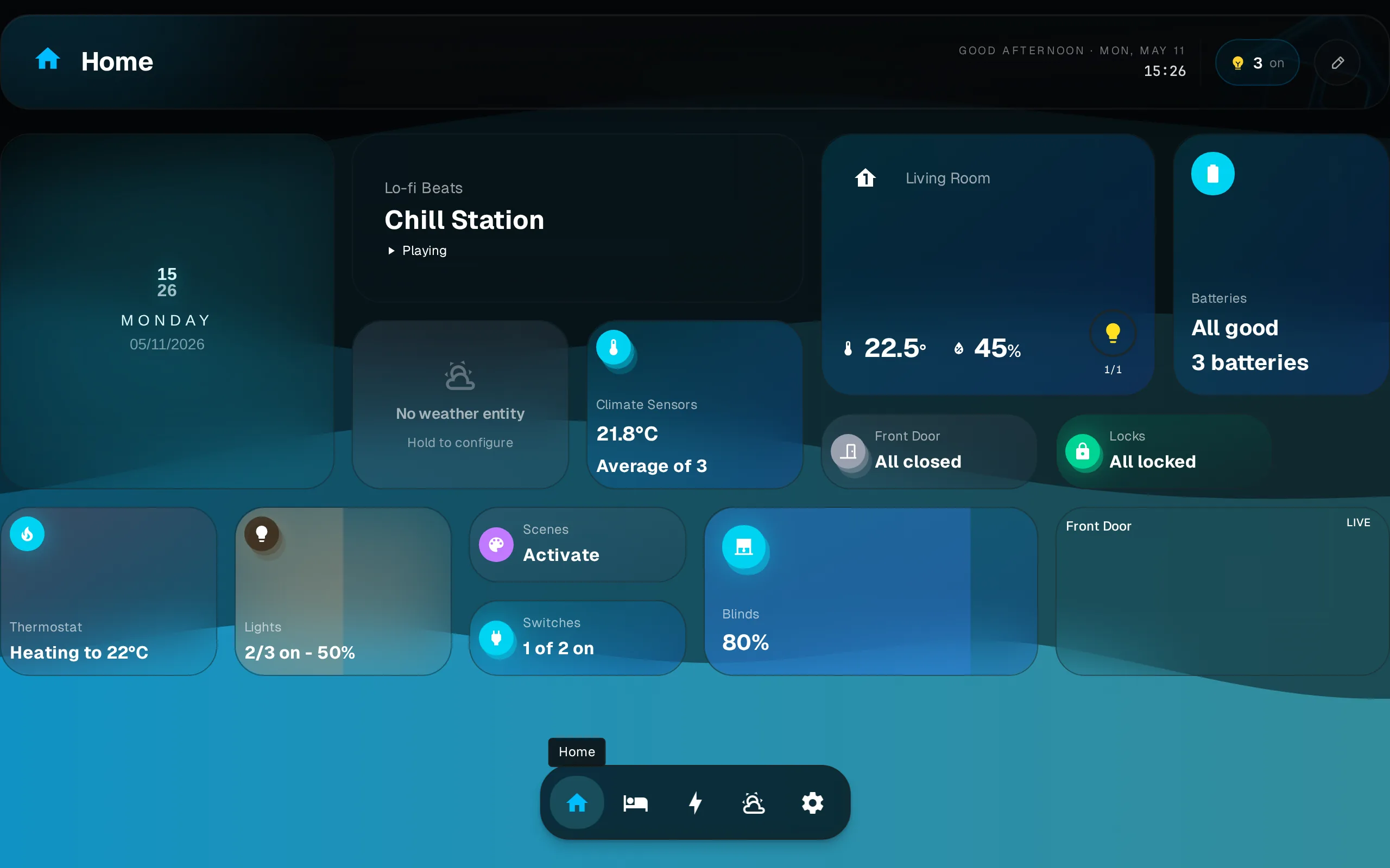
Each dashboard keeps its own independent layout per breakpoint. Rearranging on your phone does not change the desktop layout.
Layouts are per breakpoint
Dash stores a separate widget arrangement for each screen-width breakpoint. Changes you make on a phone (small breakpoint) leave the tablet and desktop layouts untouched.
Responsive Breakpoints
The grid adapts columns to the width it has. Up to Desktop it stops growing and sits centered; on a wide screen it stretches from edge to edge with no limit.
| Screen | Grid width | Columns |
|---|---|---|
| Wide screen | ≥1480px | 16 |
| Desktop | ≥1024px | 12 |
| Tablet | ≥768px | 8 |
| Phone | <768px | 4 |
Width here is what the page shows after your computer’s display scaling and the browser’s zoom, so zooming in can move a screen to a smaller layout. A dashboard made before the wide-screen layout existed gets one copied from its desktop layout, centered, the first time the new version starts.
Editing
All editing (moving, resizing, adding, removing widgets) happens in edit mode. Edit mode can also show a smaller screen’s layout, so you can arrange your phone from your computer. See Editing for the full gesture reference and step-by-step.
Multiple Dashboards
Create dashboards in Settings > Dashboards. Each has its own widget set and independent layout per breakpoint. Switch between dashboards via the dock at the bottom of the screen.
Manage dashboards (rename, delete, reorder) in Settings > Dashboards.