
Themes
9 built-in presets, each with light and dark variants, plus the themes people in your home make. Choose Use on one in Settings > Theme to wear it. Switching is instant.
Free vs Pro
| Free | Pro | |
|---|---|---|
| All 9 presets | Yes | Yes |
| Light / dark mode | Yes | Yes |
| Applying custom themes already on your Dash | Yes | Yes |
| Creator studio: open it and try everything | Yes | Yes |
| Saving themes and materials from the creator studio | Yes |
Presets, switching between themes and the creator studio are free for everyone. Open the studio, change anything, and your whole home wears it as you go. Saving a theme (Save and use, or Save without using) needs Pro, and the studio asks for it at that point. Custom themes are free to use: if one is already on your Dash, anyone can apply it, and it keeps working if Pro lapses. Pro belongs to the home, so everyone in a Pro home can save themes.
Presets
| Preset | Look | Material |
|---|---|---|
| Midnight Glass | A glass house above an infinity pool, morning by day, blue hour at night; the default | Glass |
| Monochrome Pro | A grey block city in low sunlight, windows lit at night; the strongest text contrast | Paper |
| Tide | Woodblock-print waves, indigo on rice paper | Paper |
| Forest Zen | A misty pine forest, sun rays by day, moonbeams at night | Frosted |
| Liquid Glass | Folds of clear glass with cyan and pink rim light, pale by day, dark by night | Frosted |
| Sunrise Studio | A stacked-paper sunrise between studio arches, a crescent moon at night | Paper |
| Lavender Dreams | Pen-drawn lavender on cream, on plum at night, with the ink left on | Paper |
| Chalkboard | Chalk doodles on a slate board | Chalk |
| Retrowave | A neon sunset grid | Neon |
Light, dark, or by the sun
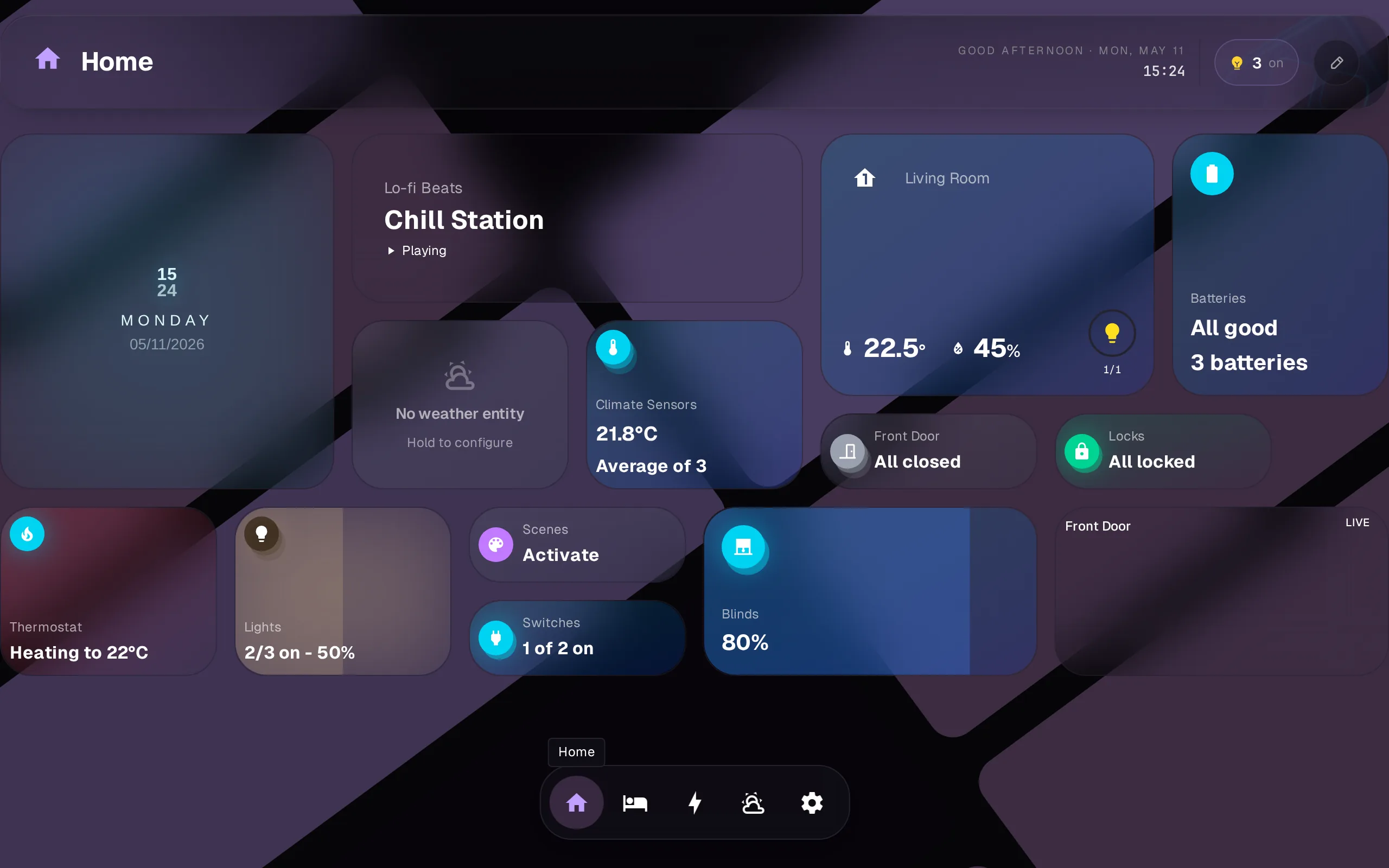
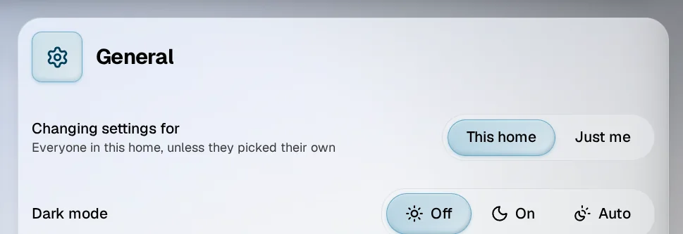
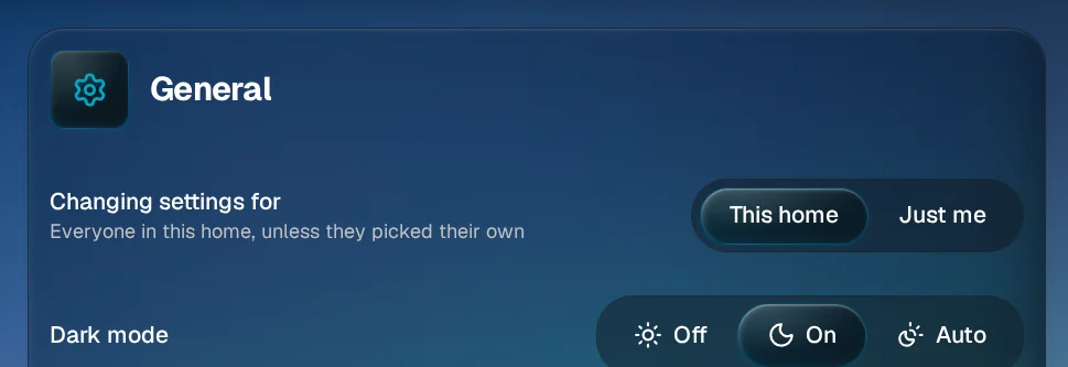
Settings, General, Dark mode, has three choices. Off keeps the light theme and On keeps the dark one. Auto follows the time of day: Sunset to sunrise goes dark at sunset and light at sunrise, using the sun times Home Assistant already knows for your home, and Custom times goes dark between the two times you pick.
Creator studio
Settings > Theme > New theme opens the studio. Edit opens one you made, Duplicate starts from any preset or from someone else’s.
The studio opens as a panel beside your dashboard, at the bottom on a phone, and your whole home wears the theme as you change it: cards, widgets, dock and background. The sun and moon at the top flip between light and dark to check both; your home’s own dark mode setting stays as it was. On a phone, drag the handle down to see the whole screen.
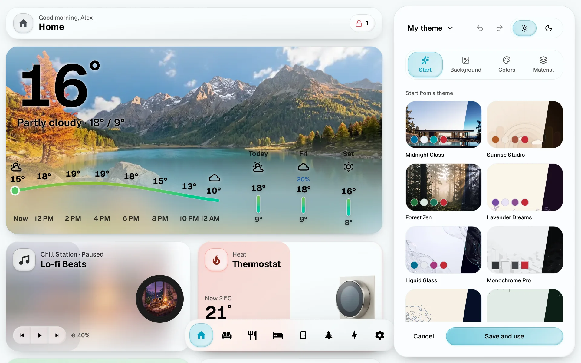
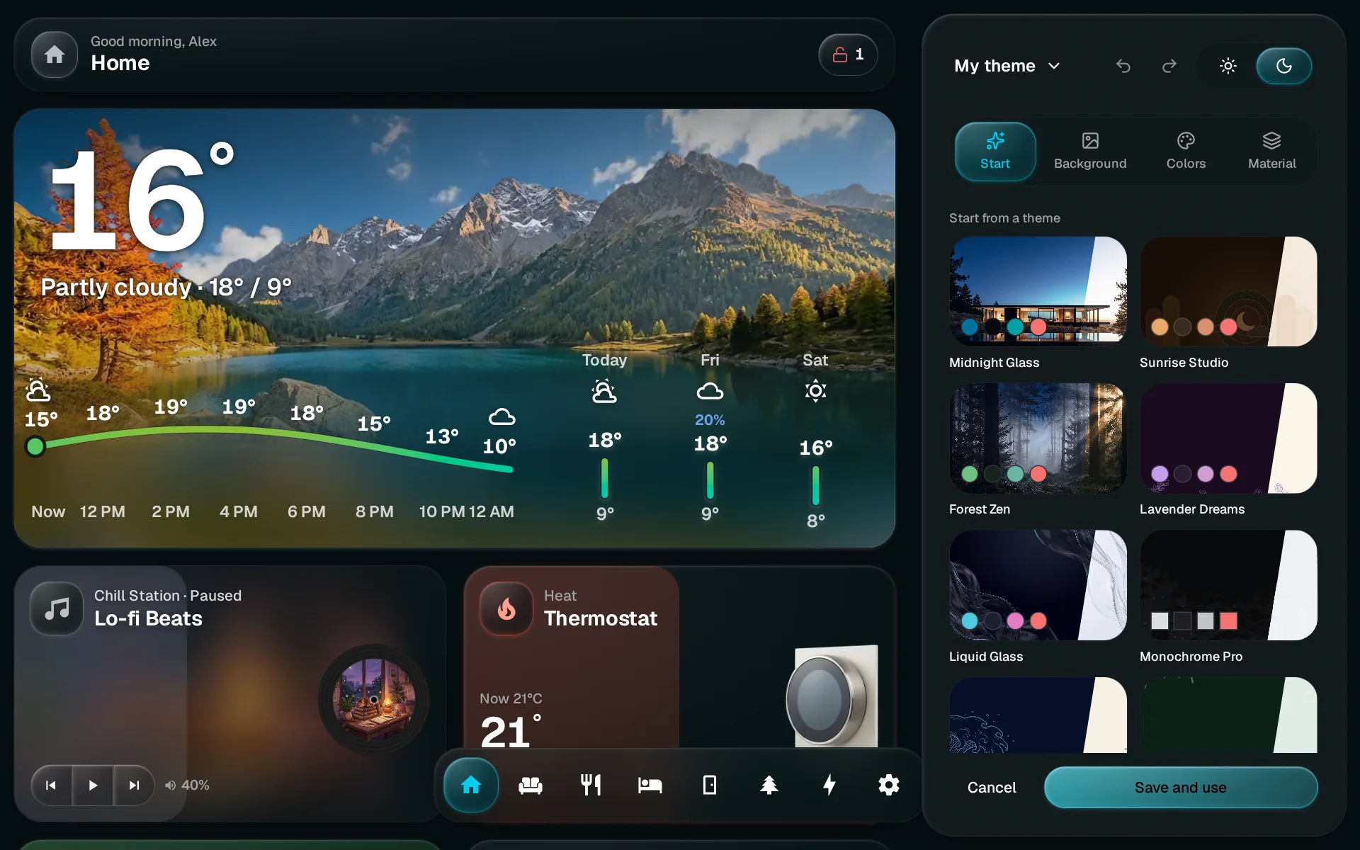
Four tabs:
- Start. Pick any built-in theme to begin from, From your photo to upload a picture that becomes the background and sets the colors, or From a color.
- Background. Tap a picture, or Upload (uploading is an admin job). Different at night gives dark mode its own picture; flip to the moon at the top to pick it. Look sets how the picture sits behind the cards: Clear, Soft, Dim or Moody. Custom opens the three sliders: Visibility fades the picture toward the theme’s background color, Softness blurs it, Vignette darkens its corners. Geometric Houses pops in when you open the app, then holds still. Abstract Pattern moves for half a minute after you open the app or touch the screen, then holds still.
- Colors. The Accent for buttons, switches and whatever is on, from the swatches or any color. Glass tint colors the glass of every card: Auto takes it from your picture, Cool, Neutral and Warm set it yourself; each shows a card over your background. Corners from Square to Round. Take colors from the picture picks an accent and a tint from a photo. Fine-tune lists every color for light and dark: each says Automatic until you change it, then Yours; tap it to send it back.
- Material. What every card, sheet and control is made of, each shown as a small lamp widget made of it. Glass is the clear glass you know, Frosted adds a fine frost to it, Paper is opaque matte stock with a cut edge, Neon is smoky glass lit from inside in its own color, Chalk draws every card in chalk on a matte board. A row of switches, sliders and buttons under them wears the material as you tune it. Fine-tune opens everything a material is made of: the glass (blur, clarity, tint, vibrancy), the light (edge, sheen, shadow, inset, where the light comes from, the rim, how much of it shows in dark mode), effects (glow and where it sits, inner glow, grain, ink), the surface (flat or raised, relief, the tint wash) and the colour (the theme’s accent or the material’s own, and a fill for widgets that have no color of their own). Reset puts the material back the way it came. The material menu, at the top of the tab, has Share with other homes (see Sharing), Save as a file, which keeps the material alone as a small
.glasshome-material.jsonfile, and Open a file, which reads one.
If text would be hard to read, the Colors tab says so, and Fine-tune offers Fix it. Undo and redo sit at the top. The menu under the theme’s name holds Rename, Share with other homes, Save without using, Start over and Delete theme.
Save and use saves the theme and switches to it: for you, or for the whole home when an admin has This home selected in General. Save without using, in the name menu, only puts it on your home’s shelf. Nothing reaches other screens until you save, and Cancel puts your home back as it was.
What the material settings do
| Setting | What it changes |
|---|---|
| Blur | How much the picture behind a card is blurred. |
| Clarity | How much of the card is solid color; low lets the picture through. |
| Tint | How strongly a card takes the color of what it shows, like a lit lamp’s warm glow. |
| Vibrancy | How rich and bright the blurred picture looks through the glass. |
| Edge | The bright line around each card. |
| Sheen | The soft light sweeping across a card. |
| Shadow | How far cards seem to float above the picture. |
| Inset | How thick the glass looks: a soft shade inside the edge. |
| Light from | Where the light comes from; turns the sheen, edge and inset together. |
| Rim | The bright line on top only, top and bottom, or all the way around. |
| Dark mode | How much of that light stays in dark mode. Lower is calmer at night. |
| Glow, Glow sits | A glow in the card’s own color, around the card or inside its edge. |
| Inner glow | Light falling into the card from the top; its color goes from white to the card’s own. |
| Grain | A fine frost over each card. |
| Ink | Draws every card by hand, like a pen sketch. |
| Face, Relief | Flat glass, or raised: buttons stand out and switches sink in, by as much as Relief says. |
| Tint wash, Wash angle | The tint as one flat color, fading across the card, or in two tones, and which way it runs. |
| Accent | The theme’s accent, or the material’s own color for what is on and what glows. |
| Fill | A wash of the accent on widgets that have no color of their own. |
Sharing a theme
Import next to New theme opens a .glasshome-theme.json file in the studio, so you see it before it joins your shelf. To save a theme as one, open the share dialog from the studio’s name menu and choose Save as a file instead. It saves the file, or opens the share sheet on a phone. Built-in backgrounds travel by name; an image you uploaded stays home, and the saved theme carries a plain background instead (for dark mode, the light one).
Who can change a theme
A theme belongs to whoever made it. They and the home’s admins can edit or delete it; everyone can use it. Right-click or long-press a theme to use, edit or delete it from the shelf; each one shows both its light and dark side and how many screens use it. Deleting one sends anyone using it back to the home’s theme. Uploading a new background image is an admin job; everyone can pick from the images already there. A home keeps up to 50 themes.